Archive
Crazy Spot Curves – Orderly Forwards
This is an interesting chart I think. It shows the spot CPI swap curve (that is, expected 1y inflation, expected 2y compounded inflation, expected 3y compounded inflation), which is very, very steep at the moment because of the plunge in oil. It also shows the CPI swap curve one year forward (that is, expected inflation for 1y, starting in 1y; expected inflation for 2y, starting in 1y; expected inflation for 3y, starting in 1y – in other words, what the spot curve is expected to look like one year from today). The x-axis is the number of years from now.
 The spot curve is so steep, it is hard to tell much about the forward curve so here is the forward curve by itself.
 Basically, after this oil crash passes through the system, the market thinks inflation will be exactly at 2% (a bit lower than the Fed’s target, adjusting for the difference between CPI and PCE, but still amazingly flat) for 6-7 years, and then rise to the heady level of 2.10-2.15% basically forever.
That demonstrates an amazing confidence in the Fed’s power. Since inflation tails are longest to the high side, this is equivalent to pricing either no chance of an inflation tail, or that the Fed will consistently miss on the low side by just about exactly the same amount, and that amount happens to be equal to the value of the tail more or less.
But what is really interesting to me is simply how the wild spot curve translates so cleanly to the forward curve, at the moment.
Little Update on Commodity Re-Thunk
Reading some of the comments people have posted in various places, I thought it would make sense to spend the time to re-create the projected-index chart in the prior article, but using something approximating GSCI weights. The GSCI is production-weighted, which means it is very heavily energy-linked (I used 2008 weights just because they were the first ones I found: 78% energy, 10% agriculture, 6% industrial metals, 3% meats, 3% precious metals), yet I was comparing its 10-year real return to an equal-weighted “prediction.” How much does this change the picture?
As it happens, quite a bit. Here is the new chart (sourced: Enduring Investments).

Call Off the Deflation Warning
Today’s column is a brief one, as I need to post a correction. Not a correction to my stuff, mind you, but to others.
Pictures like the below have been circulating now for a couple of weeks. This is a chart of the 2-year inflation “breakeven” on Bloomberg, illustrating how a “deflation warning” is sounding as they go negative.

Unfortunately, it ain’t so. I wrote to the authors of the original Bloomberg piece referenced above, and called Bloomberg (more on that later), and figured that when I pointed out that 2-year inflation expectations are nowhere near zero, the story would at least die quietly even if pride prevented a retraction. Unfortunately, that hasn’t happened and other “analysts” and news outlets have picked up the story. So, I need to print a correction for them. Unconventional, I know, but I stand for Truth.
The simple fact is that 2-year inflation expectations have fallen deeply, but remain well above zero. The chart below, also from Bloomberg, shows 2-year inflation swaps over the same period. You will notice that it has fallen mightily but remains at about 0.70%.

It turns out that the difference between the Jan-17 TIPS (which have 2 years to maturity) and the Jan-17 nominal Treasuries that are their comparator bond – taking the difference between real and nominal rates gives you the “breakeven” inflation rate that makes them equivalent investments; thus the name – is also about 0.70%.
So why does Bloomberg say the 2-year breakeven is negative? Well, Bloomberg’s “policy” is to track the April-2016 TIPS as the “2-year” TIPS until the new April-2020 TIPS are auctioned in April At that time, they will roll to using the April-2017 TIPS, which will have two years to maturity, and will use that bond for a year. While I applaud Bloomberg for having a policy, that’s no excuse for a stupid policy. There is no place in this universe where the April-16s are a 2-year note. Not even close. And not the “best we can do.”
In truth, especially for short-dated inflation expectations there is no reason not to use inflation swaps. The 2-year inflation swap is evergreen each day with a new 2-year maturity, and there are no idiosyncrasies (such as the fact that the April issues often trade cheap because of the bad seasonality associated with them, so they will usually understate true inflation expectations if you use them) to worry about.
So the story is false. The market is not discounting two years of deflation. Indeed, the reality is quite a bit different. The chart below (source: Enduring Investments – we know stuff like this) shows the 1-year inflation rate, starting 1 year from now (the 1y1y or 1×2 if you like), derived from CPI swaps. While it has come down substantially since the summer, it is not particularly out of line. In fact, it’s pretty much right where core inflation is, which makes sense: the energy spike lower is not going to continue year after year, which means that once it stops then headline inflation will return to the neighborhood of core…unless there’s a rebound in gasoline, of course. But the point is that the best guess of inflation one year from now has little to do with gasoline.
 Actually, the even-deeper point is that it is appalling how little general knowledge there is about inflation, and how journalists and even many analysts have scant idea how to get to the real story. (Hint: calling an inflation expert is a good start.)
Inflate Your Way to Victory
In keeping with the topic of the month, I present this chart.
 I really wanted to make the x-axis the compounded inflation rate since the World Cup began, but the data is just too difficult to find for many of these countries. Nevertheless, we see the broad outlines of the thesis in this chart. If you want to be excellent at soccer, inflate your economy.
The correlation between soccer wins and inflation (I arbitrarily decided to only include countries which have appeared in eight or more World Cups, so that there is some chance that they have some wins) is only 0.31, but notice the two blue dots at the upper left. I would argue that at least Germany has an inflation-driven history, although since the 1980s they have had fairly low inflation. One might argue the same with Italy, albeit to a lesser extent. If we exclude those two aberrations, the correlation rises to a whopping 0.67!
Ok, sure, this is somewhat spurious – it is largely driven by the fact that two of the winningest teams are Brazil and Argentina, which have quite a history of inflation as well as of soccer. But if the ECB discovers this, it should make sure all of the retail shops in Europe know…and they’ll have widespread support for inflation.
Core and Median CPI Converging
As expected, and as I’ve been saying for a long time, (a) median inflation is rising and now is at 2.3% y/y, the highest level since 2009, and (b) core inflation is converging to median inflation as the one-off effects of the sequester on Medicare payments is removed from the data.
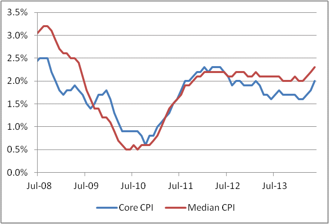 Both will continue to move higher, with Core chasing Median until they are basically right atop each other again.
Global cc: on a Note About Inflation Confusions
I haven’t written in a couple of weeks – a combination of quiet markets, and a lack of intersection between stuff that’s interesting to write about and my having time to write – but I thought I would “global cc” everyone on something I just wrote in a private email about some common misconceptions regarding the CPI:
A friend and longtime reader (name withheld) writes:
Mike,
I thought you might find these interesting….
davidstockmanscontracorner.com/memo-to-d…
davidstockmanscontracorner.com/inside-th…
My response is below:
Thanks. Unfortunately Stockman doesn’t understand what he’s talking about. He understands better than most, but then he starts saying how the BLS asks homeowners what their homes would rent for…which they do, but only to determine weights, every couple of years, not to determine OER. It says this very clear in a paper on the BLS website called “Treatment of Owner-Occupied Housing in the CPI:”
“To obtain the expenditure weights for the market basket…Homeowners are asked the often-cited question:
If someone were to rent your home today, how much do you think it would rent for monthly, unfurnished and without utilities?
This is the only place where the answers to this question is used; in determining the share of the market basket. We do not use this question in measuring the change in the price of shelter services.”
For that purpose – calculating inflation itself – a survey of actual rents is used. I can understand how the casual observer doesn’t ‘get’ this, but there’s no excuse for Stockman not to know, especially if he is railing about the CPI…he should take some time to understand its main piece.
In short, Stockman writes a good populist screed, but he avoids the main questions:
1. Is headline inflation a better predictor of future inflation than core inflation? Answer: No, even if we can now realize that the rise in energy prices was a permanent feature of the decade ended in 2010, it tells us exactly nothing about whether those are likely to persist. The Fed uses core CPI not because they don’t think people use cars (whenever a columnist uses that silly argument, I know they’re just writing to please a certain audience), but because core CPI is persistent statistically in a way that headline is not. In fact, some Fed statisticians prefer median, or trimmed-mean, neither of which proscribes any particular category. So whining about how the Fed doesn’t include the particular brand of inflation that concerns you misunderstands how and why policymakers actually use measures of inflation in policymaking.
2. Suppose the CPI represents a miserable mis-estimation of actual inflation. Then, pray tell, why does a trillion-dollar market based on that index get priced as if it is accurate? In Argentina, where the inflation numbers are made up, the inflation-linked bonds trade very cheap because they will pay off in a number that is assumed to be too low. And the bond yields are too high by roughly the amount that inflation is assumed to be understated in the future. Markets are efficient, especially big markets. How did the Fed manage to convince at least $1T in private money to misprice the bond market?
3. If the CPI is so wrong, so manipulated, then why to measures of inflation that the government has nothing to do with, like the Billion Prices Project, come up with the same number?
It’s nice that Stockman has a following. And he’s gotten the following partly by ranting about a number people love to hate. That gets him read, but it doesn’t make him right.
We’re the Government, and We’re Here to Help
Today’s article will be brief (some might say blessedly so). The topic is the publication of an article on the NY Fed’s blog entitled “Convexity Event Risks in a Rising Interest Rate Environment.”
Long-time readers may recall that I wrote an article last year, with 10-year notes at 2.12%, called “Bonds and the ‘Convexity Trade’,” in which I commented that “the bond market is very vulnerable to a convexity trade to higher yields…the recent move to new high yields for the last 12 months could trigger such a phenomenon. If it does, then we will see 10-year note rates above 3% in fairly short order.” Within a few weeks, 10-year note yields hit 2.60% and eventually topped out at 3%.
Now, the Fed tells me that this selloff was “more gradual and therefore inconsistent with a sell-off driven primarily by convexity hedging.” I suppose in a way I can agree. The sell-off was primarily driven by the fact that the Fed had abused the hell out of the bond market and pushed it to unsustainable levels. But I don’t think that’s what they’re saying.
Indeed, the Fed is actually claiming credit for the fact that the selloff was only 140bps. You see, the reason that we didn’t get a convexity-based selloff – or at least, we only got the one, and not the one I was really concerned about, on a push over 3% – is because the Fed had bought so many mortgage-backed securities that there weren’t enough current-coupon MBS left to cause a debacle!
How wonderfully serendipitous it is that even the most egregious failures of the Federal Reserve turn out to benefit society in heretofore unexpected ways. You will recall that one of the main reasons given by the Federal Reserve to purchase mortgages in the first place was to help unfreeze the mortgage market, and to provoke additional mortgage origination. In that, it evidently failed, for if it had succeeded then the total amount of negative convexity in public hands would not have changed very dramatically. In fact, it would have been worse since the new origination would have been current coupons and replacing higher coupons.
The real reason that the convexity-spurred selloff wasn’t worse isn’t because the Fed had taken all of the current coupon MBS out of the market, but because the Fed continued to buy even in the move to higher yields. A negative-convexity selloff has two parts: the increased demand for hedging, and the decreased supply of counterparties to take the other side as the ball gets rolling. In this case, one big buyer remained, which emboldened dealers who knew they wouldn’t be stuck “holding the bag.” That is the reason that the selloff was “only” 140bps and not worse.
However, the observation that the Fed’s policy was a failure, as it did not stimulate vast amounts of new mortgage activity, remains. It is true that there is less negative convexity in the mortgage market than there would otherwise have been in the absence of Fed buying. But that’s an indictment, not exoneration.
Inflation and Insurance Companies
On this site I almost never cross-reference posts that have been put up on the Enduring Investments blog, because access to that blog is only available to investors that we pre-screen while this blog is available to pretty much anyone. So, if I post something at the Enduring Investments site, it’s generally intended for a different audience than are the articles put here.
However, in this case I am making an exception because I think the article just posted on that blog, “Inflation and Insurers: How Inflation Resembles a Reinsurance Problem,” contains really important thoughts applicable to anyone in the insurance industry – and we’ve gotten feedback from a number of insurance companies that our presentation on this topic is timely and insightful. So, if you represent an insurance company or know of someone who ought to hear these thoughts, send them to the link above!
A Quick Thought on Municipal Bankruptcy
On CNBC today, analyst Meredith Whitney commented that “everybody loses” from the Detroit declaration of bankruptcy.
If that is the case, then why in the world are they seeking bankruptcy? If everybody loses, then it means nobody wins from declaring bankruptcy, and if that’s the case then it would be truly idiotic to seek it.
But of course, this is nonsense. There is no wealth being either created or destroyed in a bankruptcy proceeding; it is merely being forcibly reallocated. In this case, the winners are the taxpayers of Detroit. More to the point, it is the future taxpayers of Detroit, who were on the hook for a bunch of liabilities that they were going to have to figure out how to pay someday, but are not now going to have to pay. Those folks win big. And it’s a good thing, too, because Detroit needs more of these future taxpayers to move to Detroit.
The losers are many in number. Bondholders will lose a lot. Pensioners will, unfortunately, lose a lot. Many of the public service unions will lose a lot as their contracts are rolled back. But their losses are equal in magnitude to the gains of the future taxpayers.
Another prediction that Whitney made is on firmer ground. She said that this bankruptcy would touch off a wave of other municipal bankruptcies. I think there is a very good chance of that. I am not saying that because I have analyzed the balance sheets of many municipalities in great detail, as Whitney have (although I have seen enough, in trying to persuade some of them to hedge their post-employment medical liabilities, to be concerned). I say it because we have seen such phenomena before in industries which were overburdened. Consider telecommunications in the early 2000s. Once one big telecom company declared bankruptcy, it suddenly had a big cost advantage over its rivals, and could underprice them until its rivals followed the same path. We’ve also seen this in airlines. It seems to me that it is entirely possible that, if Detroit is able to lower taxes and reinvigorate the economy once it no longer needs to service these overwhelming liabilities, and begins to attract migrants from high-tax neighboring cities and states, then it makes the finances of places like, say, Chicago that much worse as their taxpayers leave.
Summary of My Post-Employment Tweets
- upward surprise + upward revision in #Payrolls – not too shocking, as I pointed out in last article. Weak hours though…
- Here is part of what’s happening in #payrolls: more jobs, fewer hours = employers cutting back hours to avoid Obamacare coverage
- Question is, which is better for confidence? More jobs, lower earnings & wages, or fewer, but better, jobs? Probably the former.
- average weekly hours have stagnated since 2011, even as Unemployment has fallen.
Today’s Employment report was pretty straightforward: an upward surprise to payrolls and upward revisions; a decline in the Unemployment Rate, and declines in hours worked. The upward revisions to Payrolls is not really a surprise, although seeing the Unemployment Rate continue to decline when Consumer Confidence “Jobs Hard to Get” is increasing is unusual.
Two years ago, the “Average Hours Worked” was 34.4 hours and the Unemployment Rate was 9.0%. Today, average hours worked is still 34.4 hours and the Unemployment Rate is 7.5%.
What I said about Obamacare coverage should be expanded a bit. There have been anecdotal reports (see, e.g., here and here) that many employers are cutting back hours for some employees, because they are required to offer health insurance (at steep premium increases) to part-time employees working at least 30 hours per week. The incentives are large, especially for employers who are near the 50 employee cutoff, to cut back employee hours. The way this would show up in the data, if the behavior was widespread, would be (a) a decline in average hours, as more people work shorter shifts, and (b) potentially (but not automatically) an increase in the number employed, since an employer who cuts 100 hours of work from existing employees is now 10 hours short of the labor input needed. I suspect this is only partly the case – if you cut 100 hours, maybe you add three 25-hour part-timers (it still costs money to hire, after all) – but it may help explain why the payrolls number keeps rising and the jobless number keeps falling although the average hours worked is pretty stagnant.
It would also help resolve the conundrum between the “Jobs Hard to Get” survey result and the Unemployment Rate, although it is a small divergence at present. If respondents are answering the survey as if the question is whether good or full-time jobs are hard to get, it may well be the case that those jobs are getting more difficult to find while there are more part-time positions being offered.
This is mere speculation, and storytelling, but I think it’s plausible that this is happening and may be affecting the data.